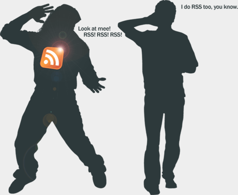
RSS. Bling or no Bling?
Times move fast on the web. RSS has been mainstream for quite a while. So long, in fact, that RSS readers are now built into the two major windows browsers, Internet Explorer 7 and Firefox 2. It’s been inbuilt for longer on the Mac, I hear. So, in our busy little ‘Web 2.0’ designs, why does the staple ingredient of Blogs and Community websites need to be emblazoned in the design? I mean, what’s the point?

Ok, let’s backtrack my thoughts a bit. I was perusing this article, which does a roundup of ‘Usability Tips’ for your Blog. I consider myself a bit of a usability, uh… well, a bit knowledgable on the subject. Point #3 is ‘Make it easy to subscribe’ talking about RSS and Podcast subscribing;
Make it easy to subscribe to your feed by placing an orange RSS button in a highly visible location. Route your feed through Feedburner so you can keep track of your subscribers. You can also offer an e-mail subscription using FeedBurner.
I disagree with this, however. If you’ve got properly set-up links and metadata in your pages, your browser should be able to detect it, like this;


So there’s no real need for a big button, right? I suppose it’s down to old understated / overstated design issue. If you want to look bright and shiny and ‘Web 2.0’ you stick a big RSS button on. That way no-one will miss the opportunity to subscribe. Frankly though, I always read the content before deciding if I might want to subscribe to the RSS. If I do, i’ll look for the RSS detection in my browser, which has to handle the process anyway.
Usability is all about clarity and optimizing the click-process. So don’t go overloading your pages with shiny buttons that aren’t nessessary, and don’t blithely add them because everyone else does. You’ll thank me when the backlash arrives.
